Code
# load additional packages
library(ggplot2)
# make custom functions
mykable <- function(data, ...) {
  knitr::kable(data) |>
    kableExtra::kable_styling(font_size = 12, ...)
}# load additional packages
library(ggplot2)
# make custom functions
mykable <- function(data, ...) {
knitr::kable(data) |>
kableExtra::kable_styling(font_size = 12, ...)
}In practice the true distribution of a random variable \(X\) is rarely known. Neither its type nor parameters. To continue working with the variable (either to describe \(X\) or its relation to other variables) we need to estimate the distribution.
Exploratory data analysis (EDA) uses observations to describe the population distribution such as its location, variability or shape. It does the job by means of graphical tools and numeric summaries that are chosen with respect to the type of random variable. A numerical summary usually contains point estimates of moments, quantiles or mode.
Rules for calculating estimates of some quantity of interest (estimand) from sample are called estimators. For example, sample mean \(\hat\mu\) is a commonly used estimator of the population mean \(E[X]\) (often denoted \(\mu\)), and the same hold for (corrected) sample variance \(\hat\sigma^2\) with respect to population variance \(var(X)\) (often denoted \(\sigma^2\)), i.e., given a sample \(\{x_i\}_{i=1}^n\) of size \(n\), the well known formulas are \[ \hat\mu = \frac1n\sum_{i=1}^nx_i \qquad\text{and}\qquad \hat\sigma^2 = \frac1{n-1}\sum_{i=1}^n(x_i-\hat\mu)^2. \] Good estimators have good statistical properties such as unbiasedness, consistency and efficiency.
Since point estimates are random variables as well, in order to quantify their precision the interval estimators are used, e.g. confidence interval or prediction interval.
If a functional representation of distribution is desired (rather than individual characteristics), there are two approaches to estimation: parametric and non-parametric. With parametric, one needs to
EDA can be helpful in identifying the overall shape of distribution and consequently in selecting proper parametric families from all possible classes.
With non-parametric approach, one usually reaches for kernel density estimation and controls the shape of distribution by choosing a smoothness parameter.
We will work with slightly modified data set mtcars containing records of features for car models available in 1974 in USA. First 6 rows out of 32 are shown here.
# elementary transformations before EDA is applied
dat <- mtcars |>
  dplyr::transmute(
    mileage = mpg,
    cylinders = as.factor(cyl),
    horsepower = hp,
    displacement = disp,
    weight = wt,
    transmission = dplyr::recode(am, `0` = "automatic", `1` = "manual")
    )
head(dat) |> pander::pander(split.tables = Inf)| mileage | cylinders | horsepower | displacement | weight | transmission | |
|---|---|---|---|---|---|---|
| Mazda RX4 | 21 | 6 | 110 | 160 | 2.62 | manual |
| Mazda RX4 Wag | 21 | 6 | 110 | 160 | 2.875 | manual |
| Datsun 710 | 22.8 | 4 | 93 | 108 | 2.32 | manual |
| Hornet 4 Drive | 21.4 | 6 | 110 | 258 | 3.215 | automatic |
| Hornet Sportabout | 18.7 | 8 | 175 | 360 | 3.44 | automatic |
| Valiant | 18.1 | 6 | 105 | 225 | 3.46 | automatic |
A visual peek into continuous distribution – from which the sample (for most of the variables) was drawn during observation – is provided by several graphical tools:
For instance consider the variable “mileage per gallon of fuel”.
dat |> ggplot() + aes(x = mileage, y = 0) + geom_boxplot() +
geom_jitter(height = 0.2) + ylab("") +
theme(axis.text.y = element_blank(), axis.ticks.y = element_blank())
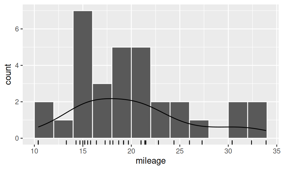
dat |> ggplot() + aes(x = mileage) +
geom_histogram(breaks = seq(10,34,2), color='white') +
geom_rug() +
geom_density(aes(y = after_stat(count)))
dat$mileage |> summary() |>
tibble::as_tibble_row() |> mykable()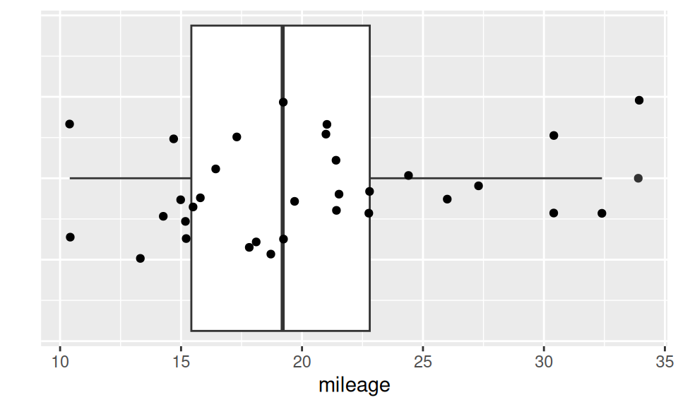
| Min. | 1st Qu. | Median | Mean | 3rd Qu. | Max. |
|---|---|---|---|---|---|
| 10.4 | 15.425 | 19.2 | 20.09062 | 22.8 | 33.9 |
From the above results we see, e.g, that 50% of observations lie in interval (15.43, 22.80), that values in category [14,16) is the most frequent or that value \(X=33.90\) could be considered as outlier, but there are also three more extremes worth of our attention.
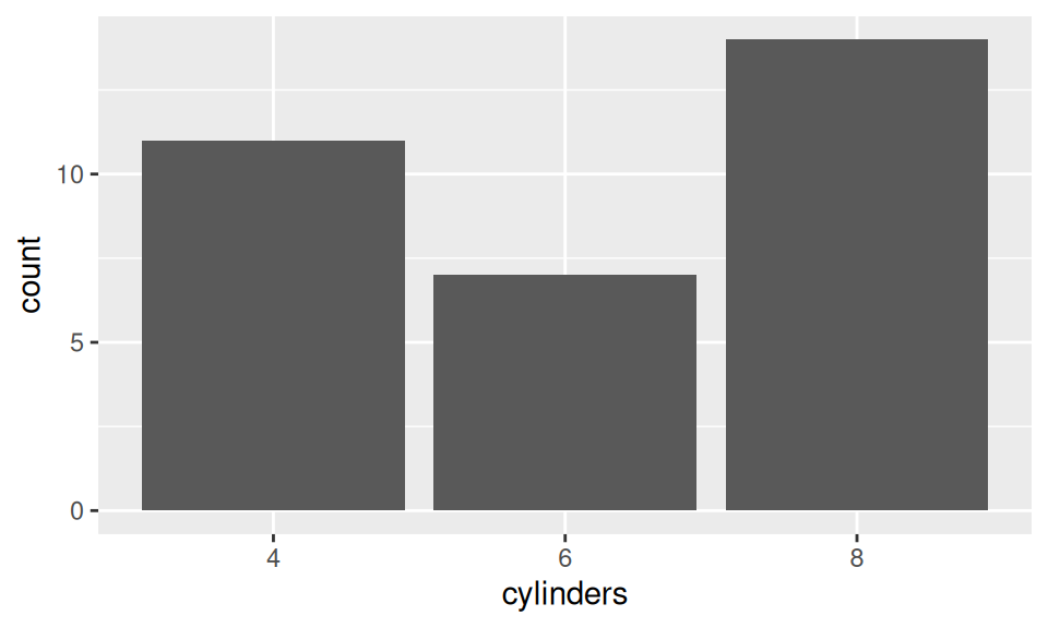
Distribution of discrete variable can be examined by a bar chart, which is a graphical representation of frequency table.
# table(dat$cylinders)
xtabs( ~ cylinders, dat) |> mykable()
dat |> ggplot() + aes(x = cylinders) + geom_bar()| cylinders | Freq |
|---|---|
| 4 | 11 |
| 6 | 7 |
| 8 | 14 |
As soon as individual behaviour of RVs is explored, we should continue with examining associations among variables.
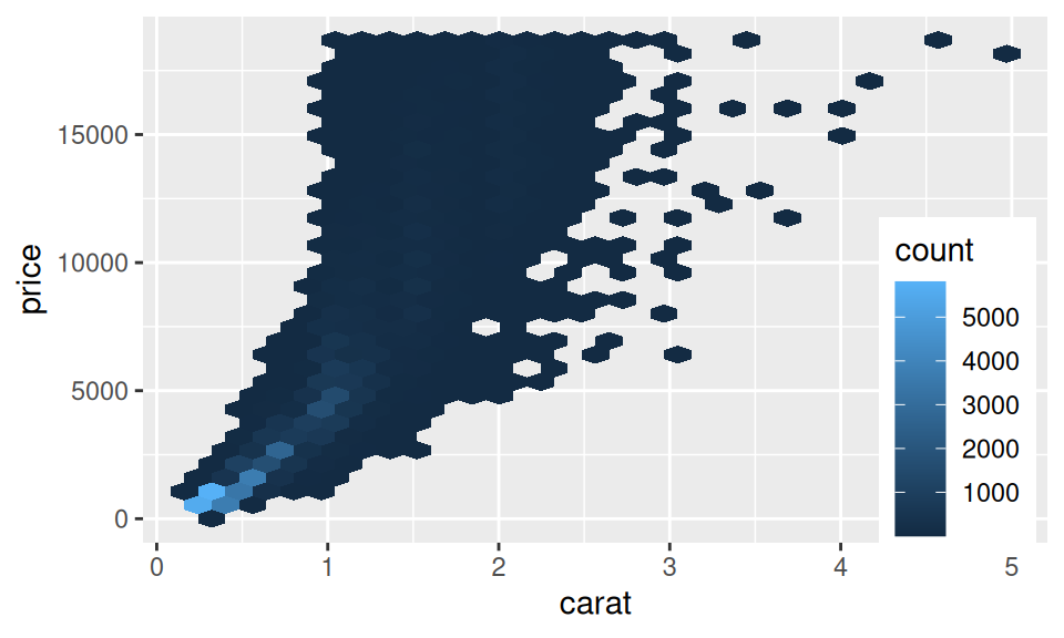
The most frequent visual tool used to describe joint distribution of two continuous RVs is scatter plot. If the sample is too large for points to be distinguished from each other, one may decrease their transparency or reach for other 2D density charts (such as heatmaps).
dat |> ggplot() + aes(x = displacement, y = horsepower) +
  geom_point()
diamonds |> ggplot() + aes(x = carat, y = price) +
  geom_hex() +
  theme(legend.position = "inside", legend.position.inside = c(0.9,0.3))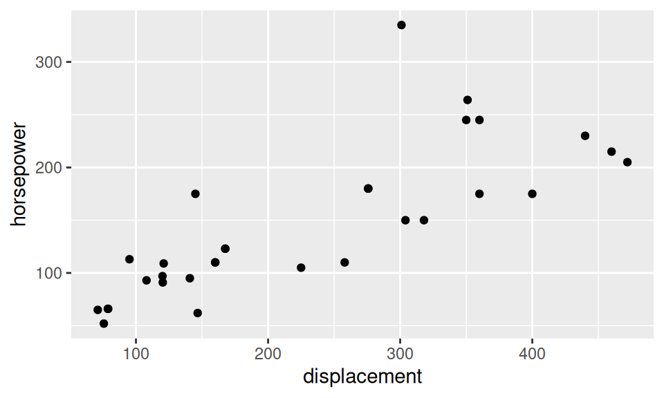
Association between continuous variables is called correlation. There are several measures of correlation (generally denoted as \(cor\) or \(\rho\)), e.g.
All of them range from -1 (perfect negative correlation) through 0 (no correlation) to 1 (perfect positive correlation).
The most frequently used one – Pearson correlation coefficient – is defined as mixed second central moment (cross-moment) called covariance normalized by standard deviations of both variables involved, \[ \begin{split} cor(X,Y) &= \frac{E\big[(X-E[X])(Y-E[Y])\big]}{\sqrt{var(X)var(Y)}}\qquad & \text{(definition)}, \\ \hat\rho &= \frac1{n-1}\frac{\sum_{i=1}^n(x_i-\hat\mu_X)(y_i-\hat\mu_Y)}{\hat\sigma_X \hat\sigma_Y}\qquad & \text{(estimator)}. \end{split} \] Spearman correlation coefficient is practically the Pearson applied to ranks of \(X\) and \(Y\).
Bellow there are the estimates for the pair of displacement and horsepower variables:
sapply(c("pearson", "kendall", "spearman"),
       function(x) cor(dat$displacement, dat$horsepower, method = x)
) |> round(3)
pearson kendall spearman
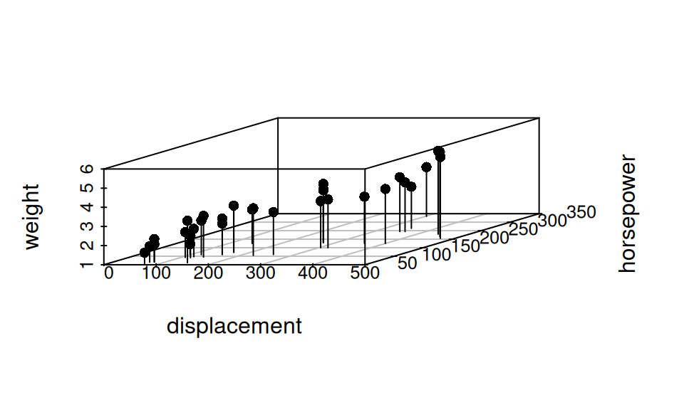
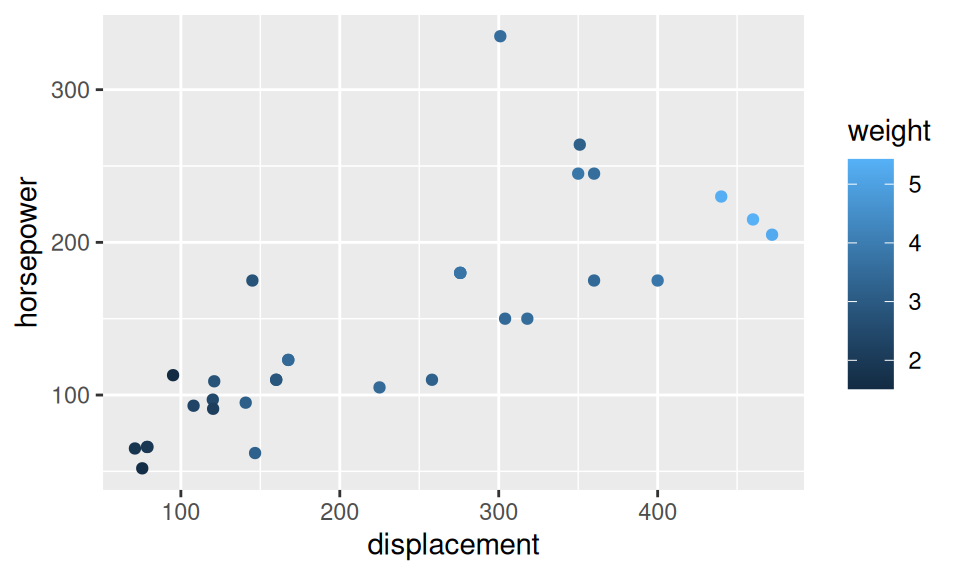
0.791 0.666 0.851 Showing more than two continuous variables can be achieved in several ways, either
dat[,c("displacement","horsepower","weight")] |> pairs(pch=16)
dat[,c("displacement","horsepower","weight")] |>
  scatterplot3d::scatterplot3d(pch = 16, type = "h")
dat |> ggplot() + aes(x = displacement, y = horsepower) +
  geom_point(aes(color = weight))
#with(dat, {
#  plot3D::scatter3D(displacement, horsepower, weight,
#                    pch = 20, col = 1, animated = TRUE)
#})


#plotly::plot_ly(dat, x = ~displacement, y = ~horsepower, z = ~weight) |>
#  plotly::add_markers(opacity = 0.5, size = I(30))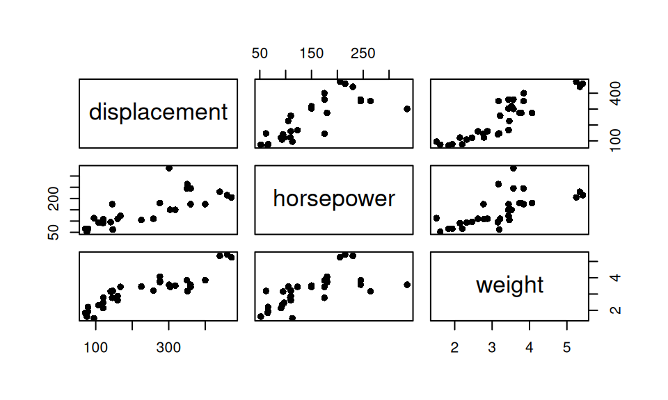
Measures of overall correlation are not much used, however pairwise correlations are often reported together as a correlation matrix. Bellow it is the Pearson’s one.
dat |> dplyr::select(displacement, horsepower, weight) |> cor() |> round(3) displacement horsepower weight
displacement 1.000 0.791 0.888
horsepower 0.791 1.000 0.659
weight 0.888 0.659 1.000For two discrete random variables we may opt, e.g, for mosaic or bar plot, that are just two different visualizations of one contingency table (bivariate frequency or crosstab)
library(ggmosaic)
dat |> ggplot() +
  geom_mosaic(aes(x = product(cylinders, transmission),
                  fill = cylinders),
              show.legend = FALSE)
detach("package:ggmosaic", unload = TRUE)

dat |> ggplot() + aes(x = cylinders, fill = transmission) +
  geom_bar(position = "dodge", color = "white")
# dat |> dplyr::select(transmission, cylinders) |> table()
xtabs(~ transmission + cylinders, dat) 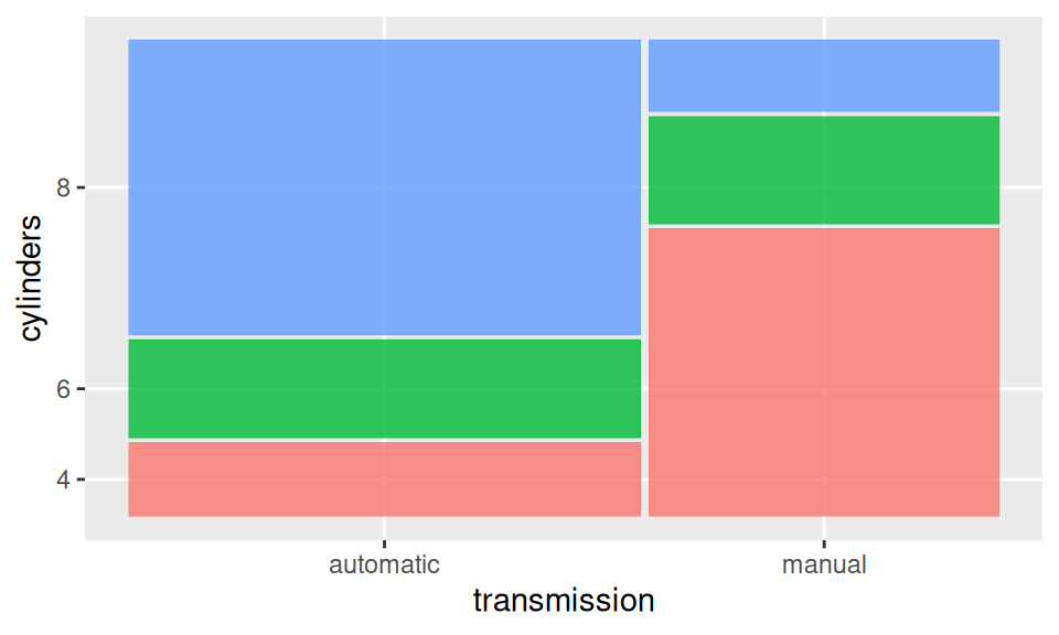
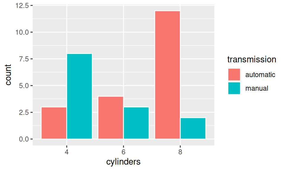
            cylinders
transmission  4  6  8
   automatic  3  4 12
   manual     8  3  2
Here it is clear that automatic transmission dominates in cars with more cylinders.
As for measures of association between two categorical RVs, one well known example is the so-called Cramer’s V. It ranges between 0 (no assoc.) and 1 (perfect).
rstatix::cramer_v(dat$cylinders, dat$transmission) |> round(3) |> setNames("Cramer V")Cramer V
0.523 Other measures include Phi coefficient (for 2x2 tables) or Goodman Kruskal’s lambda.
Association between two RV – continuous and discrete – is usually represented with box-and-whiskers, violin, ridges plot or color-distinguished smoothed histogram (since bars would be confusing).
p <- dat |> ggplot() + aes(x = mileage, y = cylinders)
p + geom_boxplot(varwidth = TRUE)
p + geom_violin()
p + ggridges::geom_density_ridges(alpha = 0.6)
dat |> ggplot() + aes(x = mileage, fill = cylinders) +
  geom_density(alpha = 0.6) +
  theme(legend.position = "inside", legend.position.inside = c(0.8, 0.8))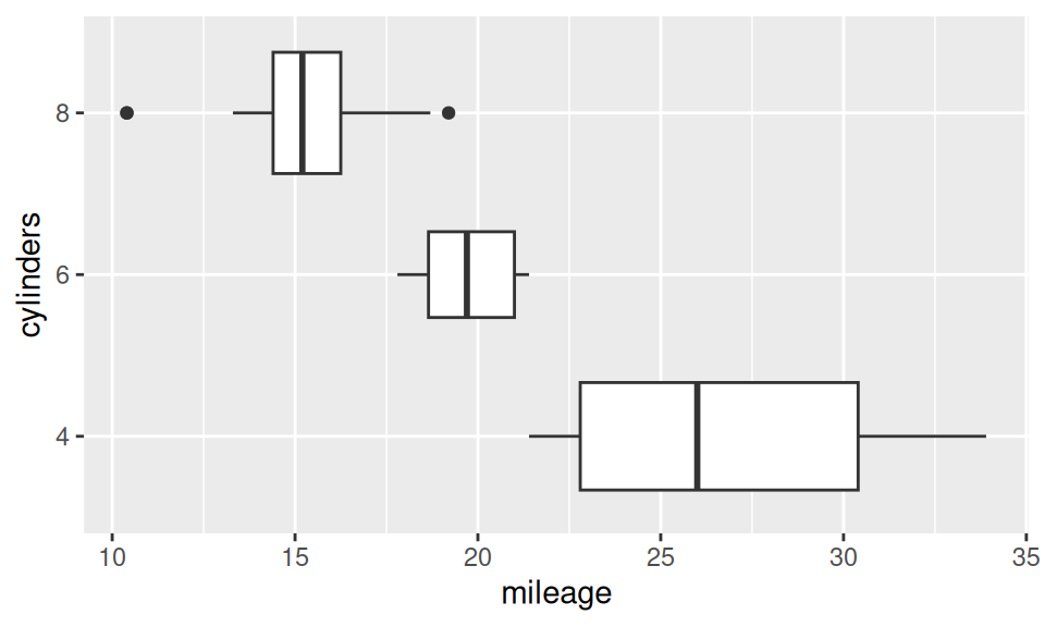
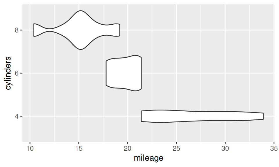
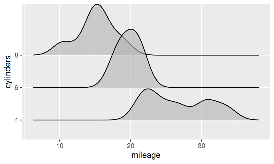
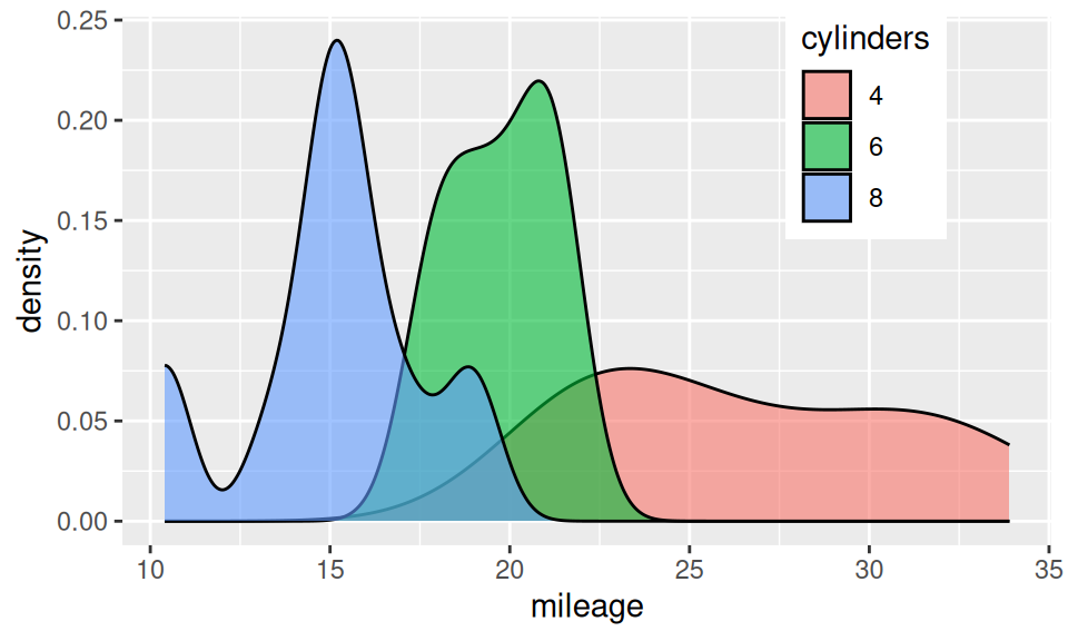
From this similar-information-carrying charts it is obvious, that mileage decreases with number of cylinders. It may be conveyed also numerically as group-wise summary of mileage distribution (i.e. conditional on cylinders).
dat |>
  dplyr::group_by(cylinders) |>
  dplyr::summarise(mileage |> summary() |> round(2) |> rbind() |> as.data.frame()) |>
mykable()| cylinders | Min. | 1st Qu. | Median | Mean | 3rd Qu. | Max. |
|---|---|---|---|---|---|---|
| 4 | 21.4 | 22.80 | 26.0 | 26.66 | 30.40 | 33.9 |
| 6 | 17.8 | 18.65 | 19.7 | 19.74 | 21.00 | 21.4 |
| 8 | 10.4 | 14.40 | 15.2 | 15.10 | 16.25 | 19.2 |
Measuring degree of association is complicated in this setting. If the categorical variable is binary, one could use point-biserial correlation coefficient (or nonparametric rank-biserial). However for more general case one usually employ a model of dependence and choose an effect size of related statistical test measuring variance explained (such as R2, Eta-squared, Cohen’s f2).
Similarly to the continuous case, to explore distribution of more than two RV, we can employ
dat |> ggplot() + aes(x = displacement, y = horsepower) +
  geom_point(aes(size = weight, color = cylinders, shape = transmission)) +
  guides(size = guide_legend(ncol = 2),
         color = guide_legend(ncol = 2))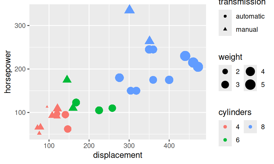
GGally::ggpairs(dat,
                lower = list(combo = GGally::wrap("facethist", bins = 10)),
                progress = FALSE)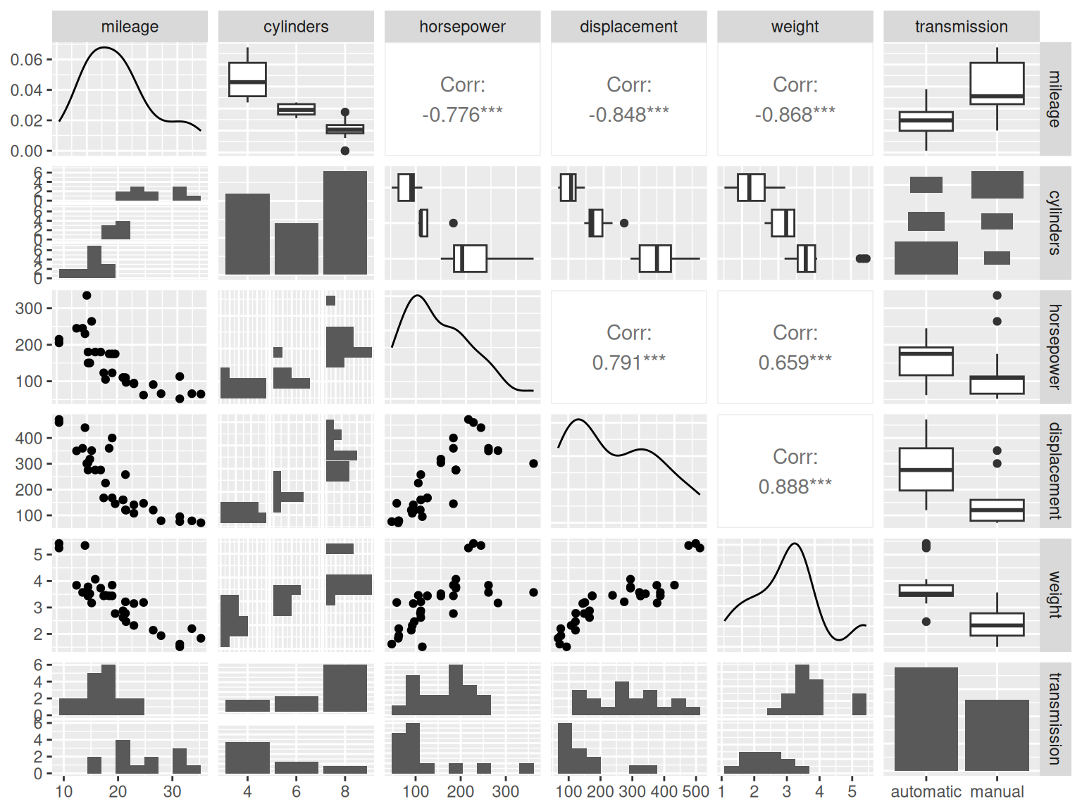
or their combination.
To draw inference about a population of interest, we mostly have no other choice than to infer from (properties of) random sample. Sample data are usually gathered as observations during some experiment. There are several sampling methods (with or without replacement, stratified or convenience sampling) selection of which depends on particular situation and economic matters. Since the sample is random, after repeating the experiment a different sample would be obtained and therefore different point estimate of a desired quantity would be calculated. For example, if the quantity of interest is mean value, the distribution of its point estimates is called sampling distribution of the mean.
Sampling distribution heavily depends on the sample size \(n\). Let us draw \(N=10000\) samples of that size from normally distributed random variable \(X\) with mean value \(\mu=20\) and variance \(\sigma^2=5^2\) and calculate estimates \(\hat\mu\). Due to law of large numbers, when sample size gets larger (\(n\to\infty\)) then sample mean gets closer to population mean (\(\hat\mu\to\mu\)).
set.seed(3)
sim <- list(`n = 1` = replicate(10000, rnorm(1, 20, 5)) |> rbind(),
            `n = 2` = replicate(10000, rnorm(2, 20, 5)),
            `n = 10` = replicate(10000, rnorm(10, 20, 5))
            ) |>
  sapply(FUN = function(x) apply(x, MARGIN = 2, FUN = mean)) |>
  as.data.frame() |>
  tidyr::pivot_longer(everything(), names_to = "SampleSize", values_to = "Mean") |>
  dplyr::mutate(SampleSize = forcats::as_factor(SampleSize))

sim |>
  ggplot() + aes(x = Mean) +
  geom_histogram(aes(y = after_stat(density)),
                 bins = 16, fill=4, color = 'white') +
  facet_wrap(~ SampleSize) +
  geom_function(fun = function(x) dnorm(x, 20,5)) +
  theme(axis.text.y = element_blank(), axis.ticks.y = element_blank())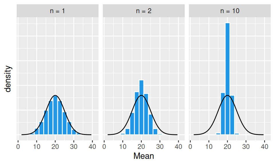
From the above graphs it is obvious, that
Moreover, the shape of the sampling distribution becomes normal as the sample size increases.
This is due to central limit theorem which states that when independent random variables are summed up, their properly normalized sum tends toward a normal distribution, even if their own distribution is not normal. It is easily seen in the next figure, where original variables follow triangular distribution – already the average of two such variables has a distribution that resembles a normal one.
set.seed(3)
sim <- list(`n = 1` = replicate(1000, EnvStats::rtri(1, min = 5.86, max = 27.07, mode = 27.06)) |> rbind(),
            `n = 2` = replicate(1000, EnvStats::rtri(2, min = 5.86, max = 27.07, mode = 27.06)),
            `n = 10` = replicate(1000, EnvStats::rtri(10, min = 5.86, max = 27.07, mode = 27.06))
            ) |>
  sapply(FUN = function(x) apply(x, MARGIN = 2, FUN = mean)) |>
  as.data.frame() |>
  tidyr::pivot_longer(everything(), names_to = "SampleSize", values_to = "Mean") |>
  dplyr::mutate(SampleSize = forcats::as_factor(SampleSize))

grid <- expand.grid(Mean = seq(5,35,0.2), SampleSize = c(1,2,10)) |>
  dplyr::mutate(dnorm = dnorm(Mean, 20, 5/sqrt(SampleSize)),
                SampleSize = paste("n =", SampleSize) |> forcats::as_factor())


sim |>
  ggplot() + aes(x = Mean) +
  geom_histogram(aes(y = after_stat(density)),
                 bins = 16, fill=4, color = 'white') +
  facet_wrap(~ SampleSize) +
  geom_line(aes(y = dnorm), data = grid, color = 2) +
  theme(axis.text.y = element_blank(), axis.ticks.y = element_blank())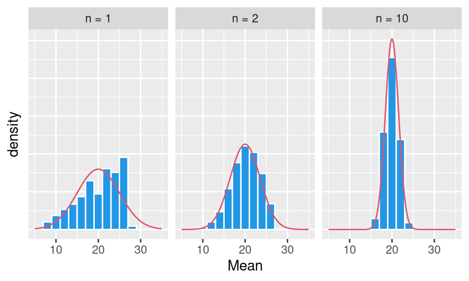
The effect of sample size on the variability of sample distribution mean value, i.e. standard error of the mean, can be quantified by formula \[ SE_{\hat\mu} = \frac{\hat\sigma}{\sqrt{n}}. \] Central limit theorem holds not only for sample mean, but – in general – for all unbiased statistics (U-statistics) such as (corrected) sample variance or other sample moments.
sim <- list(`n = 2` = replicate(10000, EnvStats::rtri(2, min = 5.86, max = 27.07, mode = 27.06)) |> rbind(),
            `n = 10` = replicate(10000, EnvStats::rtri(10, min = 5.86, max = 27.07, mode = 27.06)),
            `n = 20` = replicate(10000, EnvStats::rtri(20, min = 5.86, max = 27.07, mode = 27.06))
            ) |>
  sapply(FUN = function(x) apply(x, MARGIN = 2, FUN = var)) |>
  as.data.frame() |>
  tidyr::pivot_longer(everything(), names_to = "SampleSize", values_to = "Variance") |>
  dplyr::mutate(SampleSize = forcats::as_factor(SampleSize))

grid <- expand.grid(Variance = seq(0,100,1), SampleSize = c(2,10,20)) |>
  dplyr::mutate(dnorm = dnorm(Variance, 25, 5^2*sqrt(2/(SampleSize-1))),
                SampleSize = paste("n =", SampleSize) |> forcats::as_factor())

sim |>
  ggplot() + aes(x = Variance) +
  geom_histogram(aes(y = after_stat(density)),
                 binwidth = 10, center = 5, fill=4, color = 'white') +
  facet_wrap(~ SampleSize) +
  geom_line(aes(y = dnorm), data = grid, color = 2) +
  theme(axis.text.y = element_blank(), axis.ticks.y = element_blank()) +
  coord_cartesian(xlim = c(0, 130))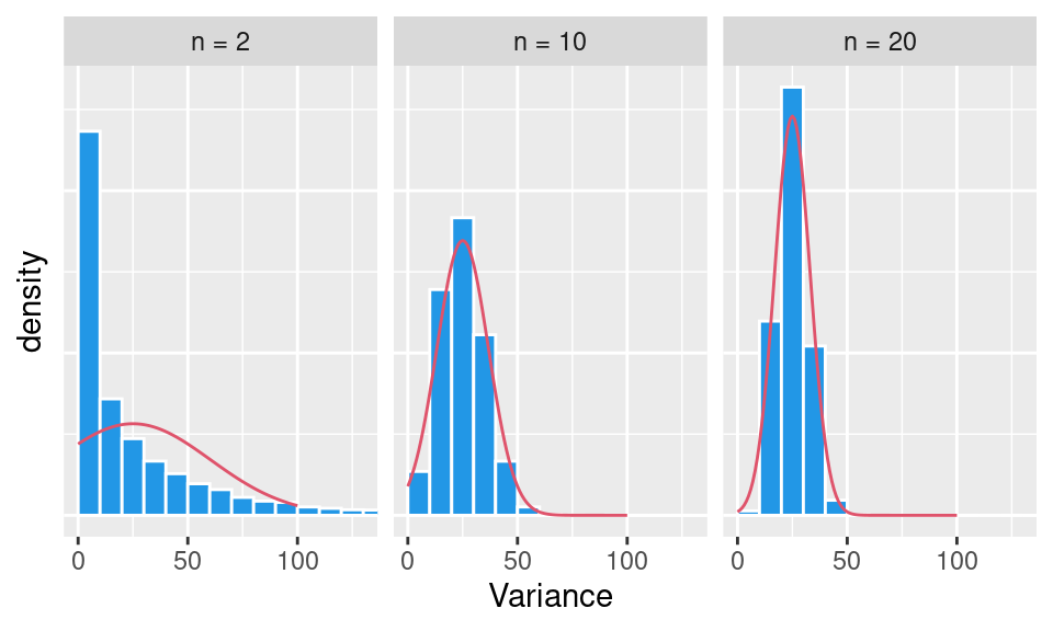
However, many times it is just too difficult to approximate the sample distribution for quantities (statistics) of interests, in algebraic way. Not to mention construction of sampling distribution by repeatedly collecting new samples from a population (it is hard enough to collect single sample). That is the point, where re-sampling can help. In one such method, the so-called bootstrap method, single observed random sample becomes a substitute for population from which new samples (called resamples) are being drawn (obviously with replacement, since \(N\) resamples of size \(n\) are needed).
Let us compare standard error for mean of cars mileage using central limit theorem and resampling (\(N=100\)). Clearly both give very similar results.
set.seed(1)
n <- nrow(dat)
c(CLT = dat$mileage |> sd() |> (`/`)(sqrt(n)),
  bootstrap = dat$mileage |>
    sample(size = n, replace = TRUE) |>
    replicate(n = 100) |>
    apply(2, mean) |>
    sd()
) |> round(3)
CLT bootstrap
1.065 1.025 Single measure of precision such as standard error may seem to be somewhat unintuitive, as it expresses only average variability of our estimate. Rather than that we would like to know an interval in which the true value lies with certain confidence (called confidence level, usually 95%). This is called confidence interval and is calculated on the basis of sampling distribution, bounded by proper quantiles. For instance, the 95% confidence interval \(CI_{m}\) for mean is defined as \[ CI_{\mu} = \left( \hat\mu + u_{0.025}SE_{\hat\mu},\ \hat\mu + u_{0.975}SE_{\hat\mu} \right) \] where \(u_p\) is a standard normal quantile associated with probability \(p\), or more directly \[ CI_{\hat\mu} = ( \tilde q_{0.025}, \tilde q_{0.975}), \] where \(\tilde q_p\) is quantile of the sampling distribution. If the population standard deviation used within \(SE_{\hat\mu}\) in the first formula is unknown and needs to be estimated, we would have to account for the extra uncertainty by replacing standard normal quantiles for quantiles of Student t-distribution, which has fatter tails.
As for the confidence interval of variance, under normality assumption it can be derived in closed form. Recall that the sample variance is a normalized sum of squares of centered random variables. If \(Y_i=\frac{X_i-\mu}{\sigma}\sim N(0,1)\), then \[
\sum_{i=1}^nY^2_i=\frac{\sum_{i=1}^n(X_i-\mu)^2}{\sigma^2}=\frac{(n-1)\hat\sigma^2}{\sigma^2}
\]
follows \(\chi^2(n-1)\) distribution, thus with probability 95% its values lie between quantiles \(q^{\chi^2}_{0.025}\), \(q^{\chi^2}_{0.975}\) of the distribution. Solving a double inequality we get confidence interval for variance \[
CI_{\hat\sigma^2}=\left( \frac{(n-1)\hat\sigma^2}{q^{\chi^2}_{0.975}}, \frac{(n-1)\hat\sigma^2}{q^{\chi^2}_{0.025}} \right).
\] By comparing CI of mileage variance from the above formula and from resampling, one realizes an obvious disharmony. On one hand the sample size \(n=32\) is meager, on the other the mileage RV is not convincingly normal.
rbind(
  bootstrap = dat$mileage |>
    sample(size = n, replace = TRUE) |>
    replicate(n = 100) |>
    apply(2, var) |>
    (\(x) c(point = mean(x),
            quantile(x, probs = c(lower = 0.025, upper = 0.975))
            ))(),
  normality = c(var(dat$mileage),
             (n-1) * var(dat$mileage) / qchisq(c(lower = 0.975, upper = 0.025), df = n-1)
  )
) |> round(2)
point 2.5% 97.5%
bootstrap 35.48 18.86 49.86
normality 36.32 23.35 64.20Confidence intervals are sometimes constructed as one sided. For example a left-sided confidence interval for mean (with unknown population variance) takes the form \(CI_{\hat\mu}= \left( \hat\mu+q^t_{0.05}\frac{\hat\sigma}{\sqrt{n}}, \infty \right)\) where \(q^t_p\) denotes quantile of \(t\)-distribution.
While graphs can be useful for drawing our attention to some surprising information about data (and features of examined phenomenon), confidence intervals can give an alert that our feeling might be statistically significant so that a formal test should be performed (see the next chapter).
Sometimes it is not enough to characterize distribution of a RV by individual quantities (such as mean, median, mode, higher order moments, interquartile range or median absolute deviation), and a functional form is needed.
A parametric approach to estimation of a functional form requires two steps:
Assessing suitability of chosen distribution (its shape is implicit to selected parametric family) is performed by so-called goodness-of-fit tests.
For some distributions, parameters can be directly calculated from moments. Perhaps the most straightforward example is the Poisson and normal distributions for which the two quantities coincide. Other simple example includes exponential distribution with parameter being the reciprocal of mean value. This is the principle of estimation approach called method of moments (MoM).
Least squares method (LS) minimizes a (measure of) distance between empirical and parametric distribution, e.g., in terms of cumulative distribution function, \[ \hat\theta=\operatorname*{argmin}_{\theta\in\Theta}\sum_{i=1}^n\Big(F_\theta(x_i) - \hat F_n(x_i)\Big)^2, \] where \(\Theta\) denotes parameter space, \(\{x_i\}_{i=1}^n\) are observations and empirical distribution function \(\hat F_n\) is usually given by formula \[ \hat F_n(x) = \frac1n\sum_{i=1}^n 1(x_i\leq x). \]
However, estimates with the best statistical properties (i.e. unbiased, consistent and efficient) are given by the third approach mentioned, the maximum likelihood method (ML), which requires to know PMF or PDF \(f_\theta\). Then \[ \hat\theta=\operatorname*{argmax}_{\theta\in\Theta}\frac1n\sum_{i=1}^n\ln f_\theta(x_i). \] The drawback of ML method is computational complexity, sensitivity to starting values and a bias for small samples.
The empirical CDF mentioned above is an example of non-parametric estimate defined in discrete points. As an alternative non-parametric method a kernel smoothing can be employed. By choosing bandwidth \(h\), the kernel density estimate (KDE) is given by formula \[ \hat f_h(x) = \frac1{nh}\sum_{i=1}^nK\left(\frac{x - x_i}{h}\right), \] where \(K\) is a non-negative function called kernel, for which one usually chooses a density function of either uniform, triangular or normal distribution.
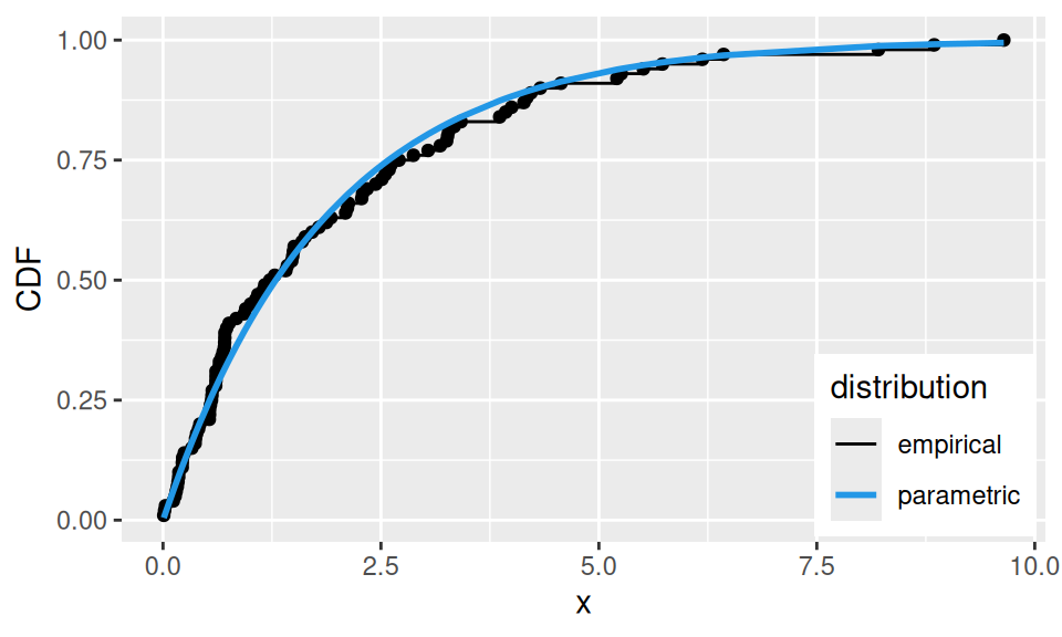
Let us compare estimates for random sample from a population with known, exponential distribution with parameter \(\lambda=1/2\).
set.seed(321)
# random data
sim <- rexp(100, rate = 1/2)
# empirical cumulative distribution function
empCDF <- ecdf(sim)
# parameter estimation
fit <- c(
  mom = 1/mean(sim),
  ml = unname(MASS::fitdistr(sim,
                             densfun = dexp,
                             start = list(rate = 1),
                             method = "Brent", lower = 0, upper = 5  # optional
                              )$estimate),
  ls = optim(par = 1,
             fn = function(lambda) sum((empCDF(sim) - pexp(sim, rate = lambda))^2),
             method = "Brent", lower = 0, upper = 5  # optional
             )$par
)
fit
mom ml ls
0.5097351 0.5097351 0.5359454 # kernel smoothed density
ker <- sim |>
density(adjust = 1.5, from = 0, n = 100) |>
(`[`)(c("x","y")) |>
as.data.frame()
sim |> data.frame(x = _) |>
ggplot() + aes(x = x) +
geom_histogram(aes(y = after_stat(density)),
breaks = 0:10, color='white', alpha = 0.5) +
geom_rug() +
geom_line(aes(x, y, color = "kernel"), data = ker) +
geom_function(
mapping = aes(color = "parametric"),
fun = function(x) dexp(x, rate = fit["ml"]),
linewidth = 1
) +
scale_color_manual(name = "distribution", values = c(kernel = 1, parametric = 4)) +
theme(legend.position = "inside", legend.position.inside = c(0.99, 0.99),
legend.justification.inside = c(1,1)) + ylab("PDF")
sim |> data.frame(x = _) |>
dplyr::mutate(x = sort(x),
empirical = rank(x)/length(x),
parametric = pexp(x, rate = fit["ls"])
) |>
ggplot() + aes(x = x, y = empirical) +
geom_point() + geom_step(aes(color = "empirical")) +
geom_line(aes(y = parametric, color = "parametric"), linewidth = 1) +
scale_color_manual(name = "distribution", values = c(empirical = 1, parametric = 4)) +
#guides(color = guide_legend(reverse = TRUE)) +
theme(legend.position = "inside", legend.position.inside = c(0.99, 0.01),
legend.justification.inside = c(1,0)) + ylab("CDF")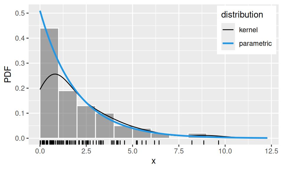
In principle, the same estimation approaches as above hold also for multivariate distributions. Just mathematical representation of joint probability distributions is more complicated, because besides individual stochastic behaviour it needs to account also for their stochastic relationship.
However, so far the topic of multivariate distribution is beyond the scope of this course.